
Five Seconds at the Top of the Homepage: What Visitors Need to See
A tradesperson opens a designer's site while a client waits on the phone. The page fills with a looping video and the words "Build something extraordinary." Nothing indicates whether this studio builds the simple, practical site the tradesperson needs. That visitor closes the tab and keeps searching.
The hero is the wide band just below the navigation, and it carries the heaviest burden on the page. It must answer three questions fast: what is being sold, whether it matters to this visitor, and where to click next. Most people settle those questions within five seconds, then either stay or leave. Someone who has just searched for a cheap website designer arrives with little context and less patience.
Everything beneath that band depends on the verdict formed up top. Strong service pages cannot rescue a hero that fails to orient anyone. Treat the opening screen as the doorway to the rest of the argument rather than as decoration. Each element should earn its place against a simple test: does this help a stranger decide?
Name the Service in the Headline
Compose the headline on the assumption that it is the only line anyone will read. "A better online presence starts here" could belong to a design studio, a consultancy, or a software tool. It orients nobody toward a specific decision. "Websites for local service businesses" tells a plumber, an electrician, or a cleaner that the page was written for them.
The sentence underneath supplies the detail that helps a reader judge fit. For a studio offering affordable web design, that might mean listing what a basic build contains: service pages, an enquiry form, and room for photographs. Concrete contents beat adjectives every time. If the client supplies the text or pays for hosting separately, those conditions belong where visitors will find them before making contact.
Jargon does nearly as much damage as vagueness. Phrases such as "bespoke digital solutions" sound impressive and communicate nothing to a busy buyer. Translate every abstract term into language the audience already uses. If a sentence could appear unchanged on four different companies' sites, it is not pulling its weight.
A quick filter catches drift back into abstraction. Hand the headline to someone unfamiliar with the business and ask who they think it serves. If their answer spans several unrelated industries, the line is too broad. Rewrite it until only one type of buyer recognises themselves.
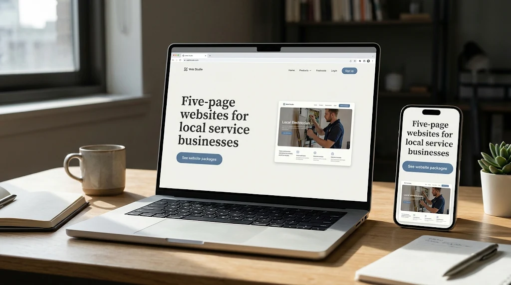
For a working picture, imagine a studio building plain sites for trades. The hero might open like this:
Websites for trades and home service businesses
Give customers a place to see your services, check where you work, and request a quote.
View website packages
A cropped phone screenshot of a finished project makes the offer tangible. Frame it so the service name, the coverage area, and the quote button stay legible at hero size. A full-page mockup may look handsome in a portfolio, but its useful details shrink into mush when displayed small. The image should prove the headline rather than compete with it.
Labels That Reveal What Happens After the Click
"Get started" asks for trust before offering information. It tells a visitor nothing about the screen behind the button. A label such as "View website packages" names the destination instead. It works well for shoppers who are still comparing providers and would rather read than talk.
A visitor who has just searched for a cheap website designer usually wants the contents of a package before any conversation begins. The label should point them to that information directly. When the offer is custom and a call is genuinely the next step, "Request a quote" states the expectation without ambiguity. Either way, the button must deliver what its words promise.
If "View website packages" opens a contact form, visitors must surrender personal details to read what they came for. Route it to the page that actually lists the packages, with scope and requirements in plain view. Every extra field at that moment loses people who were close to enquiring. Friction here quietly cancels the progress the hero just made.
A studio that sells affordable web design can use a second link to answer a question the button cannot. "See recent work" lets a hesitant visitor sample the style before opening the packages. Render it as plain text so the primary action keeps its visual weight. On a narrow screen the link may be better placed further down, where space allows.
Testing the Hero on a Handheld Screen
Wide previews flatter every layout. On a desktop monitor the headline holds one line, the image sits beside it, and the button enjoys generous margins. Shrink the viewport and that headline can wrap three or four times. Stack a tall header and an image above the copy, and the offer may fall below the first screen.
Load the live page on a phone from a fresh browser session. That reproduces what a newcomer sees, consent banner included, and reveals problems a desktop screenshot hides. Check that the headline reads comfortably and the main action is visible without hunting. If the image buries the copy, move it below the button and test again.
Text over photography deserves its own pass. A subhead explaining affordable web design may rest on a dark area of the desktop image and land on a bright patch in the mobile crop. Adjust the framing until the contrast holds at both sizes. Type that reads perfectly on a monitor can vanish on a phone held in daylight.
Loading behaviour matters as much as layout. Screenshots conceal blank flashes, oversized files, and animations that delay the message. Preview with animations disabled and on a throttled connection to see what arrives first. Then tap the button and confirm the next screen is as usable as the hero implied.
A Five-Second Check Before Reading the Analytics
Before drawing conclusions about performance, run a simple experiment. Show the hero to someone who fits the target profile and has never seen the design. Display the phone version for five seconds, hide it, then ask what stood out. Follow with open questions about what the business offers and what they could do next.
Let them answer before you probe further. Their unedited words reveal more than a tidy summary of your intentions. If a participant who recently searched for a cheap website designer recalls a marketing firm rather than a website studio, the headline has failed. Write down exactly what they said.
Compare each account with your intent. When people remember a striking photograph but cannot say what the company does, imagery is overpowering the offer. When the offer registers yet the button does not, inspect its position and whatever competes with it. Each pattern points to a different edit.
A second task on the live page adds behavioural evidence. Ask a fresh participant to discover what the basic package includes, then watch where they click and whether they reach the detail. A studio selling affordable web design often finds the same pinch point appear across sessions. That path separates a button people miss from one they read and misinterpret.
Once the hero is live, track the action the business actually values. For a service company that usually means a submitted enquiry, with hero clicks counted as one step along the way. A visitor who arrived by searching for a cheap website designer may reach the packages page and still drop out over missing details or a confusing form. When clicks climb while enquiries stay flat, the leak sits downstream of the hero.
If traffic allows, an A/B test can show whether a hero change moves that outcome. On quieter sites, begin with the problems you can already see directly. When visitors repeatedly mistake the studio for an advertising agency, revise the headline and show it to fresh participants. Save any claim of improvement until the enquiry data supports it.

 English
 Arabic
 French
 Spanish
 Portuguese
 Deutsch
 Turkish
 Dutch
 Italiano
 Russian
 Portuguese (Brazil)
 Greek